

Key Takeaways
What negative space actually means in a room
In graphic design and fine art, negative space refers to the empty area surrounding a subject. In interior design, the concept translates directly: it's the uncovered wall, the clear countertop, the gap between furniture pieces, the unadorned stretch of shelf. Most decorating instincts work against it - when something looks bare, the impulse is to fill it.
But empty space isn't the absence of design. It's an active ingredient. Rooms that feel sophisticated and calm almost always use negative space deliberately. The eye needs somewhere to rest between focal points. Without that rest, a room feels relentless rather than inviting. Research into how visual environments affect mood suggests that cluttered, overstimulating spaces can contribute to feelings of stress and mental fatigue - something worth considering when you decorate. For strategies that support your overall sense of calm at home, the mental well-being hub covers everyday approaches worth exploring.
Understanding negative space also helps explain why a room that checks every decorating box can still feel off. The design principles behind rooms that feel complete explore this in depth. Below are six concrete ways to put negative space to work in your own home.
Negative Space Isn't the Same as Minimalism
Using negative space intentionally does not require committing to a minimalist aesthetic. A maximalist room with rich color, pattern, and layers can still use deliberate gaps to guide the eye and create visual rhythm. The goal is intentionality - knowing where to pause - not necessarily owning fewer things. Even small, strategic breathing room within a fuller space can shift how a room reads overall.
Six ways to use empty space as a design tool
Let one wall stay bare
In a room full of artwork, curtains, and shelving, a completely bare wall might seem like a mistake. In practice, it acts as a visual rest stop - somewhere the eye can pause before moving on. A single undecorated wall gives adjacent pieces, like a gallery arrangement or a large mirror, more dramatic presence by contrast.
This approach is especially effective in smaller rooms. If every vertical surface competes for attention, the space feels compressed. One quiet wall opens it up. For renters unsure about what changes they can make, check out practical reversible decorating ideas that preserve your deposit.
A bare wall is not a gap - it's the breathing room your best pieces need.
Group objects, then surround them with space
Instead of spreading décor evenly across a shelf or console, cluster items into one or two distinct groupings and leave the rest of the surface empty. This technique - common in Scandinavian and Japanese interior traditions - transforms a collection of objects into a composed moment rather than background clutter.
The empty sections flanking a grouping are just as deliberate as the objects themselves. Try pulling everything off a shelf, then placing back only what truly earns its spot. The resulting negative space will frame what remains. For more on open shelving decisions, see open shelving vs. closed cabinets.
Grouping and spacing transform scattered objects into a composed, intentional arrangement.
Choose furniture that reveals the floor
Furniture with visible legs - sofas, chairs, side tables - allows light to pass underneath and shows more of the floor plane. This creates the perception of more square footage and keeps the room from feeling bottom-heavy. The gap between the floor and the furniture base is negative space doing quiet, effective work.
Low-slung, solid-base pieces close off the floor and can make a room feel denser than it is. If your space already feels tight, switching to furniture with exposed legs is one of the more impactful changes you can make without a renovation. Smart strategies for small living rooms expand on this idea with practical layout guidance.
Furniture with visible legs opens up the floor plane and makes any room feel larger.
Use wide mat borders on framed artwork
The mat - the border between a print and its frame - is a contained example of negative space. A wide, generous mat draws the eye inward to the artwork itself, giving even a modest print a gallery-caliber presence. Narrow or absent mats make framed pieces look crowded and diminished.
As a rule of thumb, designers often recommend mats that are proportionally wider than they feel comfortable at first. The instinct is to fill the frame; the result of more space is almost always better. This principle connects directly to planning a gallery wall layout where spacing between frames matters just as much as mat width within them.
A wide mat border gives even modest artwork the presence of a gallery piece.
Keep countertops and tabletops mostly clear
Horizontal surfaces accumulate quickly - mail, candles, books, chargers, decorative bowls. Each item added reduces the visual breathing room of the surface itself. Keeping countertops and tabletops largely clear does two things: it makes the room easier to clean, and it makes the few objects that remain feel intentional and considered.
A single sculptural object on an otherwise bare kitchen counter reads as a design statement. Five objects of equal size read as clutter. Restraint is not minimalism for its own sake - it's giving your favorite things the space to actually be seen. If you're weighing where to invest in better pieces, a practical budget framework for home décor can help you prioritize.
A clear surface doesn't look empty - it makes the objects that remain feel chosen.
Space artwork higher and give it room to breathe
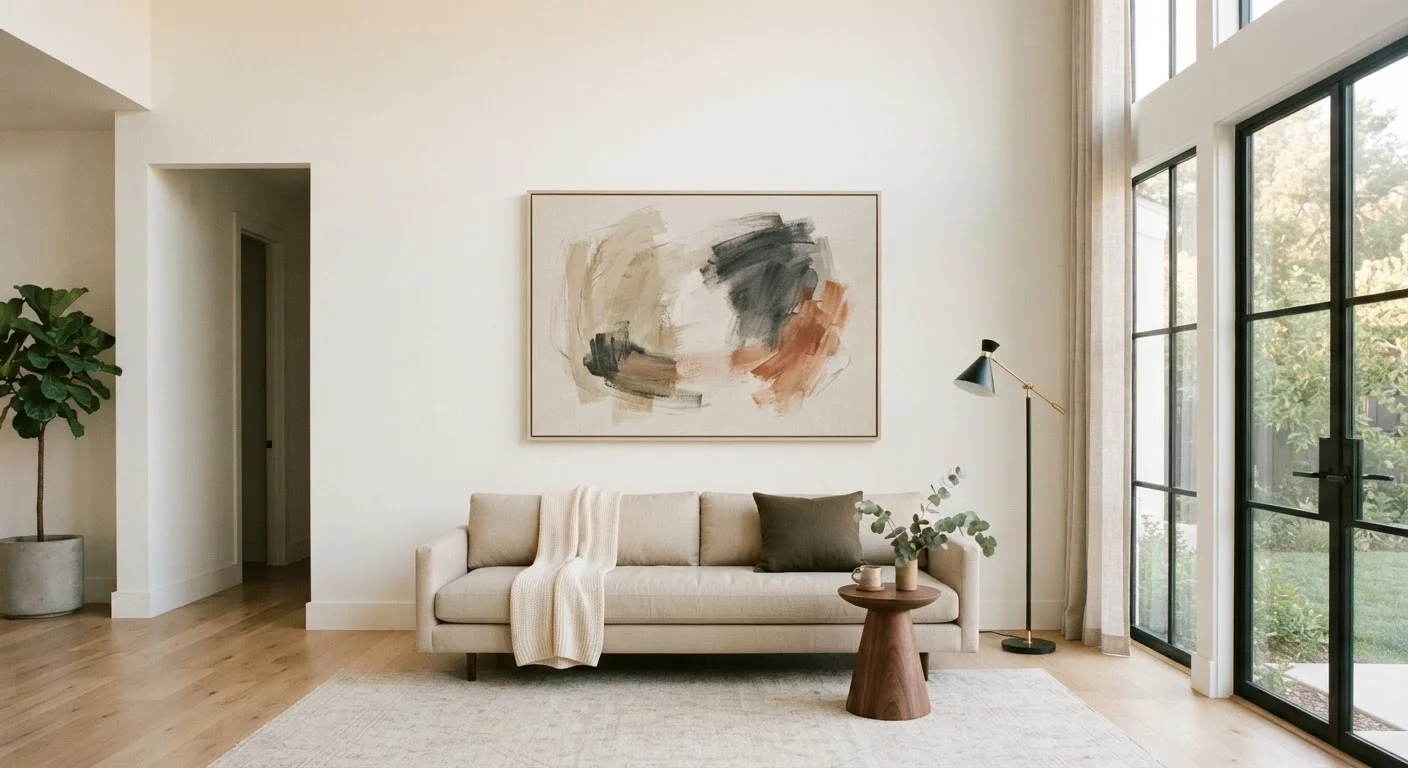
Artwork hung too low or crowded by furniture loses its impact. When a piece has open wall space above, below, and around it, the viewer's eye travels to it naturally. Giving art vertical breathing room - particularly above a sofa or bed - makes it feel like a considered anchor, not an afterthought.
The negative space surrounding a piece of art is part of its composition in the room. Crowding that space with nearby objects or furniture pulled too close competes with it. For a deeper look at how spacing and placement shape a room's overall feel, design principles behind rooms that feel right offers useful grounding.
Open wall space around artwork turns it into a room anchor, not an afterthought.
Bringing it together without going bare
Using negative space well is less about owning fewer things and more about being deliberate with placement. The question to ask isn't what should I add? but what is earning its place here? A room designed with intentional breathing room tends to feel more resolved - and it's easier to maintain because there's less visual competition demanding attention.
If a room still feels off even after editing, the issue may be about balance, scale, or rhythm rather than quantity. Common reasons a decorated room still feels wrong can help diagnose what's missing. And if you're questioning whether a particular design rule - like always filling a wall - actually holds up, common interior design myths examined is a useful reality check.
Negative space is one of the most accessible design tools available because it costs nothing. The only investment is the willingness to leave something out.