

Key Takeaways
Warm vs. Cool Paint Undertones
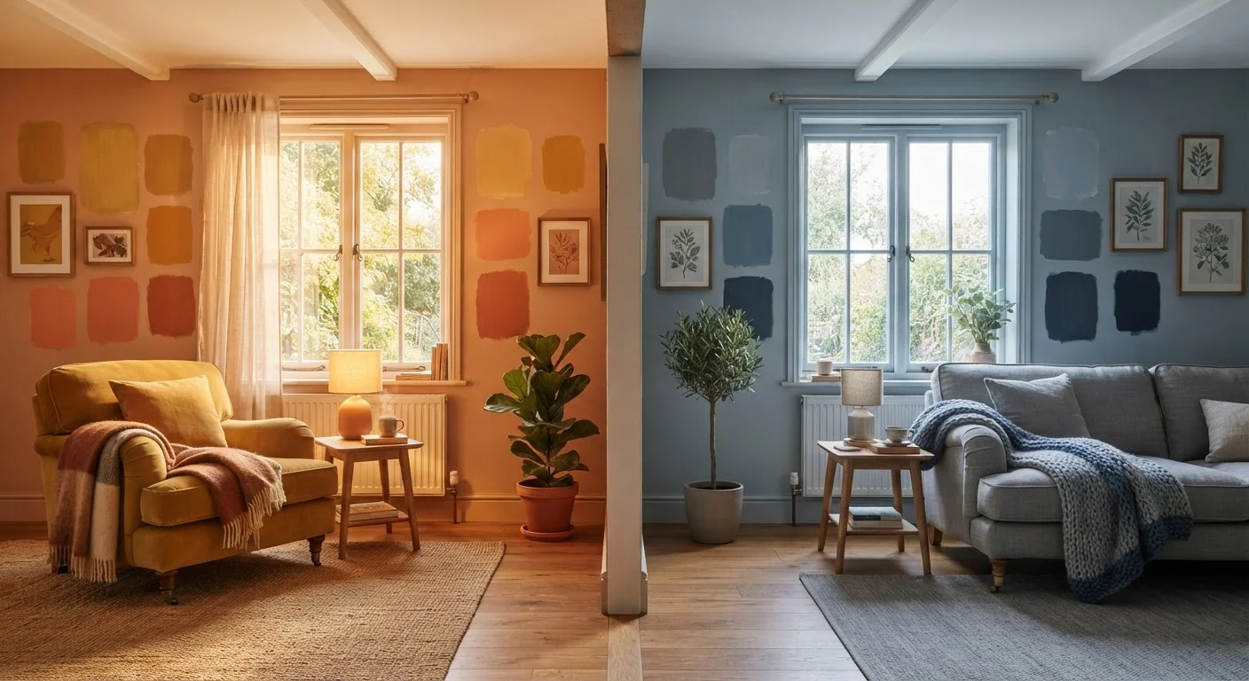
Every paint color - even neutrals like white, beige, or grey - has an undertone that leans either warm or cool. Warm undertones pull toward reds, oranges, and yellows, while cool undertones lean toward blues, greens, and purples. These hidden hues affect how a room feels, how large it appears, and how well it works with your existing furnishings and light sources.
Undertones are distinct from a color's hue: a beige can appear pink (warm) or green (cool) depending on its pigment base. This is why two supposedly similar neutrals can clash dramatically when placed side by side.
What Warm and Cool Actually Mean in Paint
When designers talk about warm and cool paint tones, they aren't referring to the obvious reds or blues on a color wheel. They're talking about the subtle undertone hidden inside every color - including the whites, greys, and beiges most people gravitate toward for a "safe" choice.
Warm undertones contain traces of red, orange, or yellow. Cool undertones carry hints of blue, green, or violet. A taupe can look sandy and golden (warm) or faintly purple-grey (cool) depending on its pigment mix. Neither is better by default - but each behaves very differently depending on where and how it's used.
Understanding this distinction is one of the foundational concepts behind rooms that feel pulled-together. As the elements that make a room feel finished show, it's rarely one big decision that creates harmony - it's a series of smaller ones that align.
~70%
Of homeowners repaint within 2 years of moving in
Industry surveys from paint manufacturers suggest most homeowners repaint their new home relatively quickly, often to correct color choices made without testing undertones in their specific light conditions.
3-4x
Larger swatch needed for accurate undertone evaluation
Professional color consultants generally recommend testing swatches at least 12 inches square - far larger than a standard 2-by-3-inch paint chip - to see how undertones behave at wall scale.
How Light Changes Everything
Paint doesn't exist in a vacuum - it exists in light. The same color can read completely differently depending on the type and direction of light hitting it.
Natural daylight from a north-facing window is bluish and indirect, which intensifies cool undertones and can make them feel cold or stark. Warm paint tones counteract this effectively. South-facing rooms flood with golden daylight for much of the day, which can push warm tones into orange or yellow territory - cool or mid-tone colors tend to stay balanced in these conditions.
Artificial lighting adds another layer. Incandescent bulbs and warm-spectrum LEDs amplify warm undertones and soften cool ones. Daylight or cool-white bulbs do the opposite. If your room uses a mix of natural and artificial lighting throughout the day, your paint color can look noticeably different morning to evening - which is exactly why testing matters so much.
Layering your lighting sources is as important as the paint itself, because the two systems interact constantly.
Test Under All Your Lighting Conditions
Before finalizing any paint color, observe your test swatch at three distinct times: morning natural light, midday natural light, and evening under your artificial lighting. Take a photo at each point to compare. If the undertone shifts dramatically between any of these - especially toward a color you dislike - consider adjusting the undertone rather than the hue.
The Effect on Room Size and Mood
Beyond aesthetics, undertones have a measurable effect on how a room feels spatially and emotionally.
Warm tones tend to advance - meaning they make walls feel closer together. This creates a cozy, enveloping atmosphere that works well in dining rooms, bedrooms, or reading nooks where intimacy is the goal. The psychological warmth of these colors can also make spaces feel more stimulating and social.
Cool tones tend to recede, making walls feel farther away. This is why cool pale blues and soft greens are common choices for small bathrooms or compact living rooms - they visually expand the space. Cool palettes also tend to feel calmer and more restful, which is why they frequently appear in bedrooms and home offices.
That said, value (how light or dark a color is) matters just as much as temperature. A deep, dark cool color can feel just as dramatic and enclosing as a rich warm one. These effects work along a spectrum, not as absolute rules.
Matching Undertones to Your Existing Room
Paint doesn't exist alongside bare walls - it lives next to flooring, furniture, textiles, and fixed architectural elements. Mismatched undertones are one of the most common reasons a decorated room still feels off, even when each individual piece is attractive on its own.
Wood tones are a key factor. Most natural wood floors and furniture carry warm undertones - honey, amber, or reddish brown. Pairing these with a strongly cool paint can create an uncomfortable tension. A warm-neutral or a warm-leaning cool (like a sage green or dusty blue with a slight grey warmth) tends to bridge the gap more naturally.
Metal finishes matter too. Brass, gold, and bronze hardware read warm; chrome, nickel, and matte black read cooler. Neither is a deal-breaker, but they contribute to the room's overall temperature - and paint should account for them.
If your room already feels visually confused, it may not be the furniture at all. Understanding why a room feels off can help you diagnose whether undertone conflict is the culprit before you repaint.
Undertones in Trim and Ceiling Paint Matter Too
Most people focus on wall color, but trim and ceiling paints carry undertones as well. A warm-white ceiling paired with a cool-grey wall can create a subtle but nagging visual tension. For a cohesive room, try to keep trim, ceiling, and wall undertones in the same temperature family - or choose a true neutral that bridges both.
How to Test Before You Commit
The single most reliable piece of advice professionals offer: never choose paint from a chip alone. The sample card in the store is viewed under artificial retail lighting, at small scale, and surrounded by other colors that influence your perception. None of those conditions match your home.
Instead, paint a large swatch - at least 12 by 12 inches - directly on the wall, or on a piece of white poster board you can move around the room. Observe it at different times of day and under the artificial lighting you actually use. Notice what it does next to your flooring, your sofa, your trim color.
If the undertone conflict only appears when you test it in context, that's valuable information - it means the color might work better somewhere else, or a slightly adjusted undertone could solve the problem entirely.
The same instincts that guide paint selection also apply to mixing furniture and materials: test combinations in context rather than making assumptions about how they'll interact.
“Color is profoundly contextual. The same hue can appear completely different depending on the surface it's next to, the light falling on it, and the size of the area it covers. There is no such thing as a color in isolation.”
— Josef Albers, Painter and color theorist, author of Interaction of Color