
Color Coordination Made Simple: How Everyday Americans Can Dress With Intention

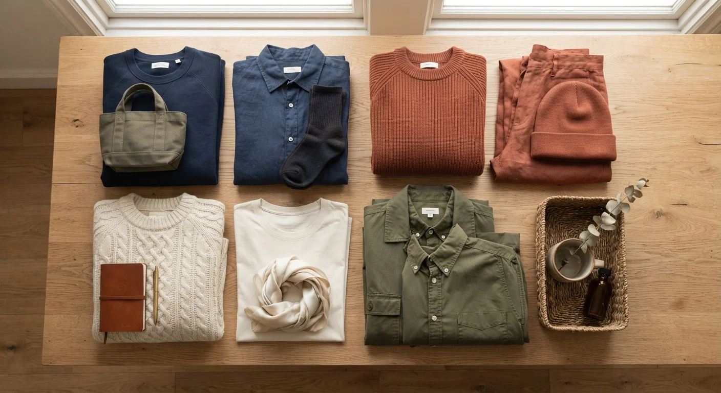
Key Takeaways
Color Coordination
Color coordination is the practice of combining clothing colors in a way that looks intentional and visually balanced. It relies on simple relationships between hues - like pairing opposites or staying within a single tonal family - to create outfits that feel put-together without requiring formal design training. Anyone can apply these principles with the clothes they already own.
Color relationships are often mapped on a traditional color wheel, where complementary colors sit opposite each other, analogous colors sit adjacent, and neutrals (black, white, grey, tan, navy) pair easily with nearly everything.
Why Color Feels Complicated (When It Doesn't Have to Be)
Most people who struggle with color coordination aren't struggling with taste - they're struggling with a framework. Without a few organizing principles, getting dressed becomes a guessing game of "does this go?" every single morning.
The good news: you don't need a design degree or a color-analysis session to dress confidently. The same foundational ideas that designers use can be distilled into practical, real-life habits. And once they click, they apply to every outfit, every season, no matter your budget. If you're also working on getting the most out of what's already in your closet, this practical guide to building cohesive outfits is a great companion read.
Start With What You Already Own
Before buying anything new, lay out your existing clothes and identify which neutrals you already have. Chances are you already own the backbone of a coordinated wardrobe - you may just need a framework for combining it. Color confidence comes from understanding your pieces, not from acquiring more of them.
The Three Frameworks That Actually Work
Color theory has many layers, but for everyday dressing, three approaches cover nearly every situation:
- Complementary pairing: Colors opposite each other on the color wheel - think navy and burnt orange, or forest green and rust - create natural visual contrast without clashing. These combinations feel dynamic and intentional.
- Analogous grouping: Colors that sit adjacent on the wheel - like olive, mustard, and warm brown - share undertones, so they blend naturally. This is the secret behind "earthy" or "tonal" looks that feel cohesive without effort.
- Neutral anchoring: Build around a neutral (black, white, grey, navy, camel, or cream) and let one accent color do the work. This is arguably the most versatile approach for a real-life wardrobe because neutrals act as a reset between any two colors.
These same principles show up in interior design too - if you're curious how color relationships work in a room context, understanding warm and cool paint tones covers the underlying ideas in depth.
62%
Americans report feeling more confident when they like their outfit
According to a survey by the American Psychological Association exploring the link between clothing choices and self-perception.
3
Maximum colors recommended per outfit by most style educators
A widely cited guideline in fashion education and personal styling, intended to help everyday dressers create visually cohesive combinations.
80%
Of a wardrobe typically goes unworn on any given day
A commonly referenced statistic in wardrobe psychology suggesting most people regularly wear only a small fraction of what they own.
Skin Undertone: Your Personal Color Guide
Color coordination isn't just about how hues relate to each other - it's also about how they interact with your skin. Undertone (the subtle warm, cool, or neutral cast beneath your complexion) is a useful, low-pressure guide for identifying which colors tend to look most vibrant and flattering on you specifically.
- Warm undertones (golden, peachy, olive skin) are generally complemented by earthy, warm hues: terracotta, camel, olive green, warm reds, and chocolate browns.
- Cool undertones (pink, bluish, or rosy skin) tend to shine in jewel tones, navy, emerald, burgundy, and crisp whites.
- Neutral undertones sit between the two and can work across a broad range of colors.
These are tendencies, not rules - personal preference always wins. But using undertone as a starting point can cut down the trial-and-error significantly.
Undertone Is a Guide, Not a Gatekeep
Skin undertone analysis can be a helpful starting point, but it's never a strict limitation. Many people with warm undertones love wearing cool jewel tones - and wear them beautifully. Use undertone as one data point among many, not as a rule that overrides what you already know looks great on you.
Putting It Into Practice: Simple Rules for Real Outfits
Once you understand the frameworks, a few practical habits make color coordination feel automatic:
- Cap your palette at three colors per outfit. Including your shoes and bag in the count keeps looks clean and prevents the scattered feeling of too many competing hues.
- Use a pattern as your color map. If a shirt has three colors in its print, you've already been handed a coordinated palette - just pull one of those colors into a solid piece and you're done.
- Build your wardrobe base in neutrals. The more of your core pieces (trousers, blazers, outerwear) that exist in neutral tones, the easier every accent color works with them. Wardrobe staples that work across seasons covers exactly which foundational pieces earn their keep.
- Try tonal dressing. Wearing varying shades of the same color family - light blue, medium blue, dark navy - is effortlessly stylish and practically foolproof.
For guidance on when these rules can and should be broken, style rules worth breaking offers a grounded look at which conventions still serve you.